Tuft and Needle is an entity of Serta and Beautyrest / Simmons mattress and bedding company.
Within the UX team, we managed and maintained 3 different company brand’s unique Design Systems. During 2022, the small UX team redesigned the entire CMS system and design systems for all of their external e-commerce websites to live in Shopify.
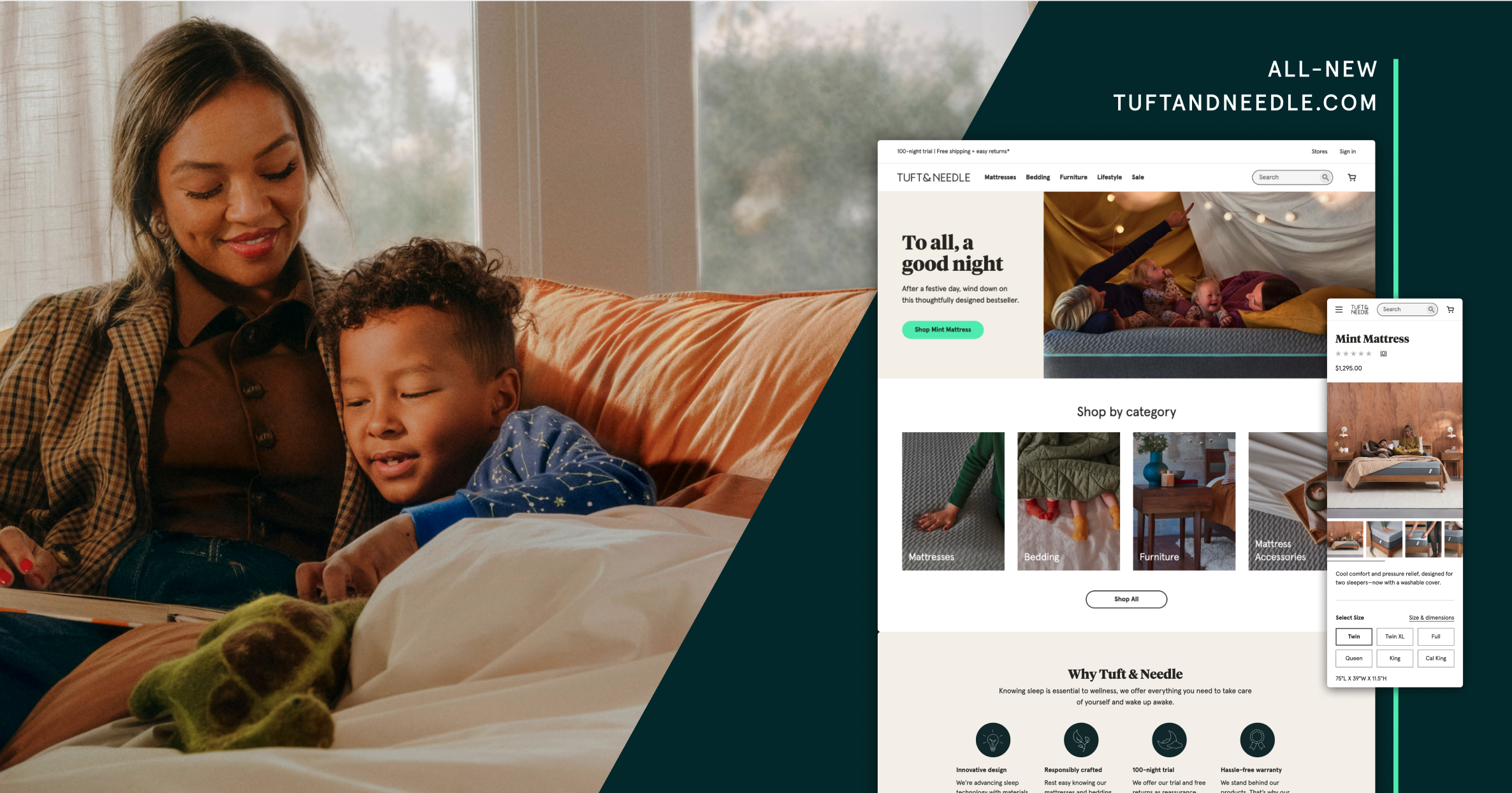
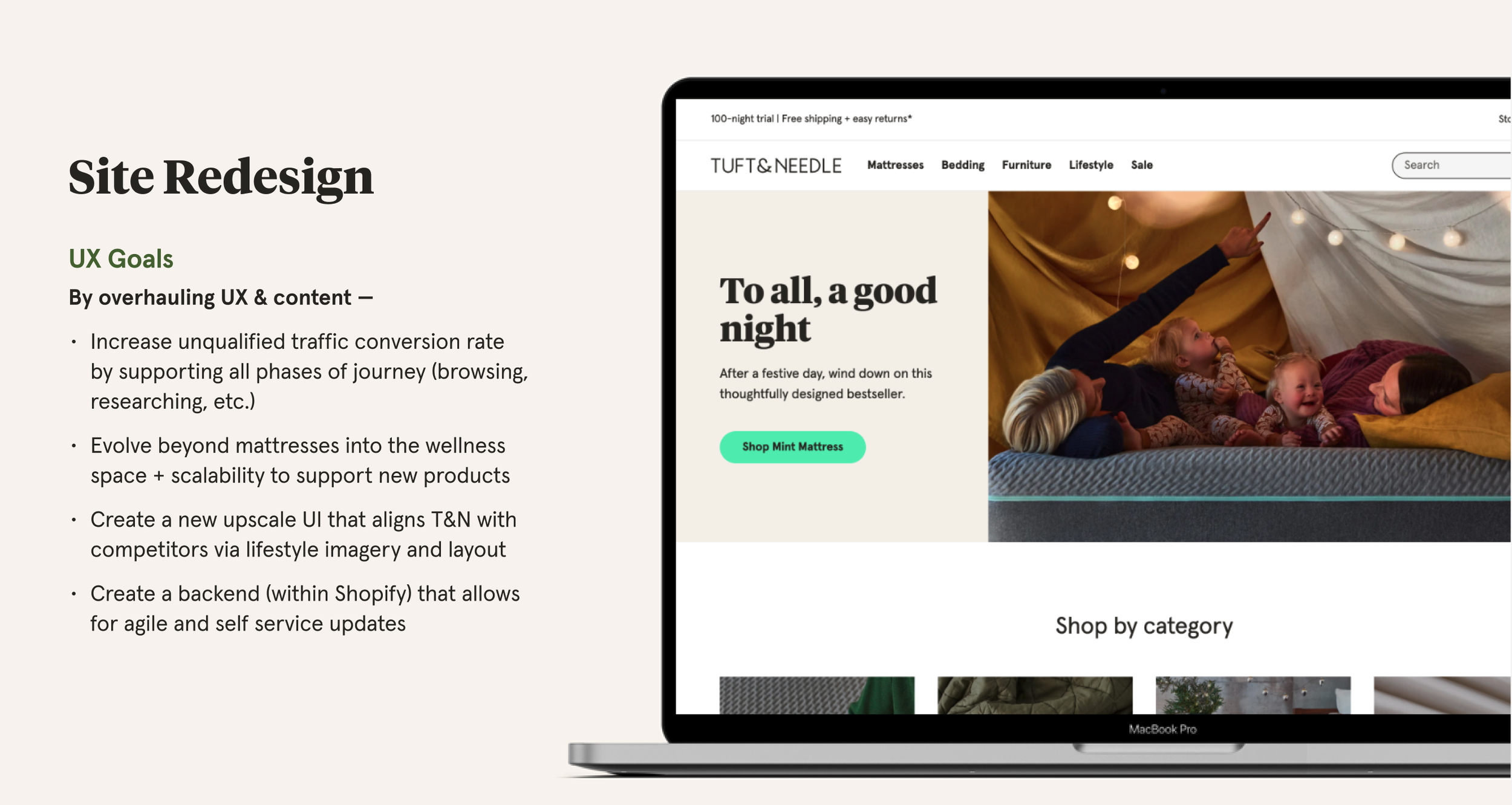
To entirely revamp Tuft and Needle's e-commerce website, we undertook a comprehensive redesign by crafting a new CMS library seamlessly that integrated into the Shopify platform. Over a span of two months, our team, consisting of myself and another designer, conducted thorough research, engaged in stakeholder interviews, and executed the complete redesign process. We not only successfully presented the revamped design but also implemented it within the designated timeframe.
The old website displayed each product name without a clear hierarchy of nesting it within a category, leading to issues with scalability and clarity, especially on mobile. Additionally, our user testing revealed that the tags introduced more visual clutter rather than offering guidance.
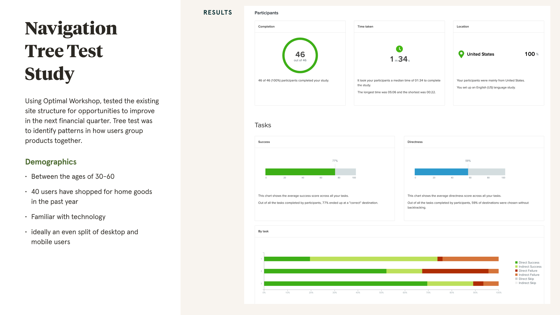
Based on the UX tree test carried out in collaboration with our UX research team, our focus was on ensuring scalability not only for adding products but also for incorporating categories that facilitated the expansion of navigation on the site.
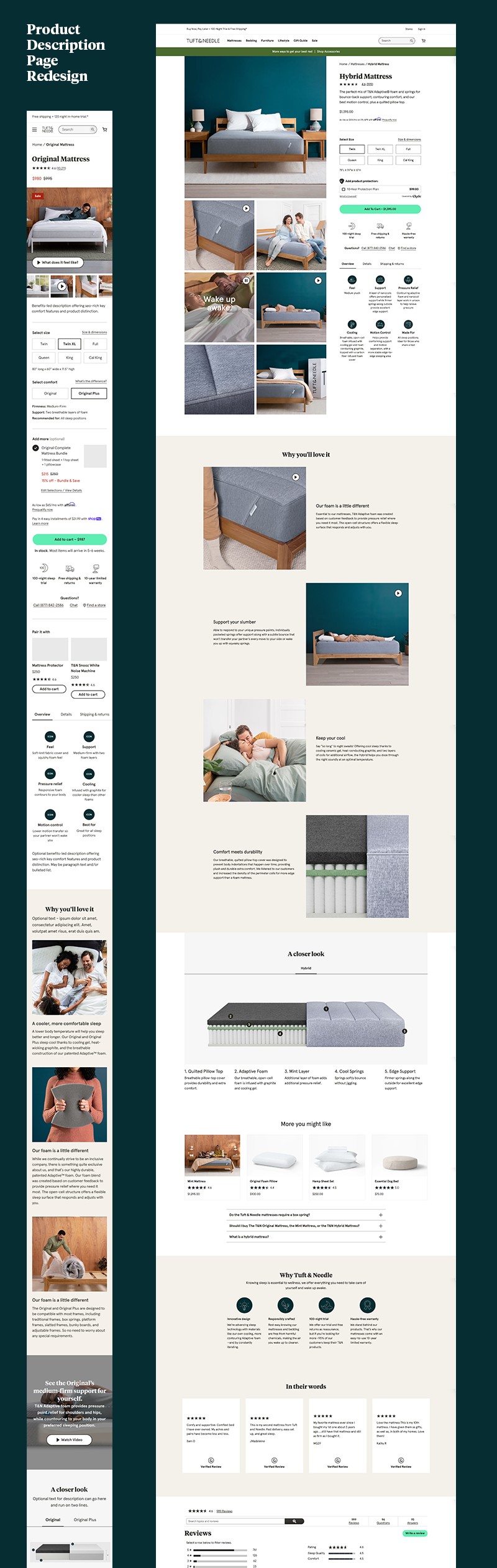
This page played a crucial role in the deliberations for an e-commerce site overhaul. My responsibility was to shape the user experience with a focus on consumers making choices among product options. The process involved integrating extensive research on best practices, including studies with the Baymard Institute, conducting CRO tests, and gathering feedback from our internal customer service team.
During the redesign, one of my primary objectives was to ensure that our customers had a seamless experience tracking their purchase history within the Account Management pages.
We maintained a healthy relationship with Serta’s main stakeholders to incorporate the 125-year-old’s companies standards and accomplishments into the redesign. Managing user tests that was unique to their brand.
This brand has a very unique luxury reputation to maintain and we learned about its customer base to learn how to present information. One of the challenges was making sure their customers understand upgrades in the mattress options. I spent time testing how to properly convey specific aspects of the mattresses to help conversion rates.
Designing the interface for controlling a smart mattress that adjusts firmness and comfort within an app. Conducting in-person user testing for experience and usability.
Medical Solutions is a healthcare staffing company that has consistently earned top spots on the largest travel nurse staffing and fastest-growing U.S. staffing firms lists.
My role is to manage a common design system, common workflows, and user experiences for three separate client portals that provide job postings and candidate consideration.
Developing a SaaS portal dedicated to Hospitals and Medical facilities, enabling them to seamlessly post and oversee open positions, evaluate candidates, and efficiently hire for vacant roles. I engaged in rapid prototyping to successfully launch the MVP, providing clients with streamlined access to manage Human Resources functions throughout the hiring process.
Rapid prototype, designed with the aim of successfully launching the MVP.
Revamp the IT ticketing system and internal incident management system designed to handle technical support issues.
Internal product designed for the IT Help Desk
The Affiliate Portal was developed to enable medical recruiters to match vacant positions with qualified candidates. My role involved fostering stakeholder connections to ensure the tool effectively served recruiters, granting them access to available positions while leading ideation brainstorming, designing prototypes and getting stakeholder approval.
Spreetail is an e-commerce company that largely develops software tools for their employees. My role is to manage software design within the 6 different warehouses Spreetail hosts across the United States.
My audience requires information to be communicated quickly through both mobile apps and desktop designs.
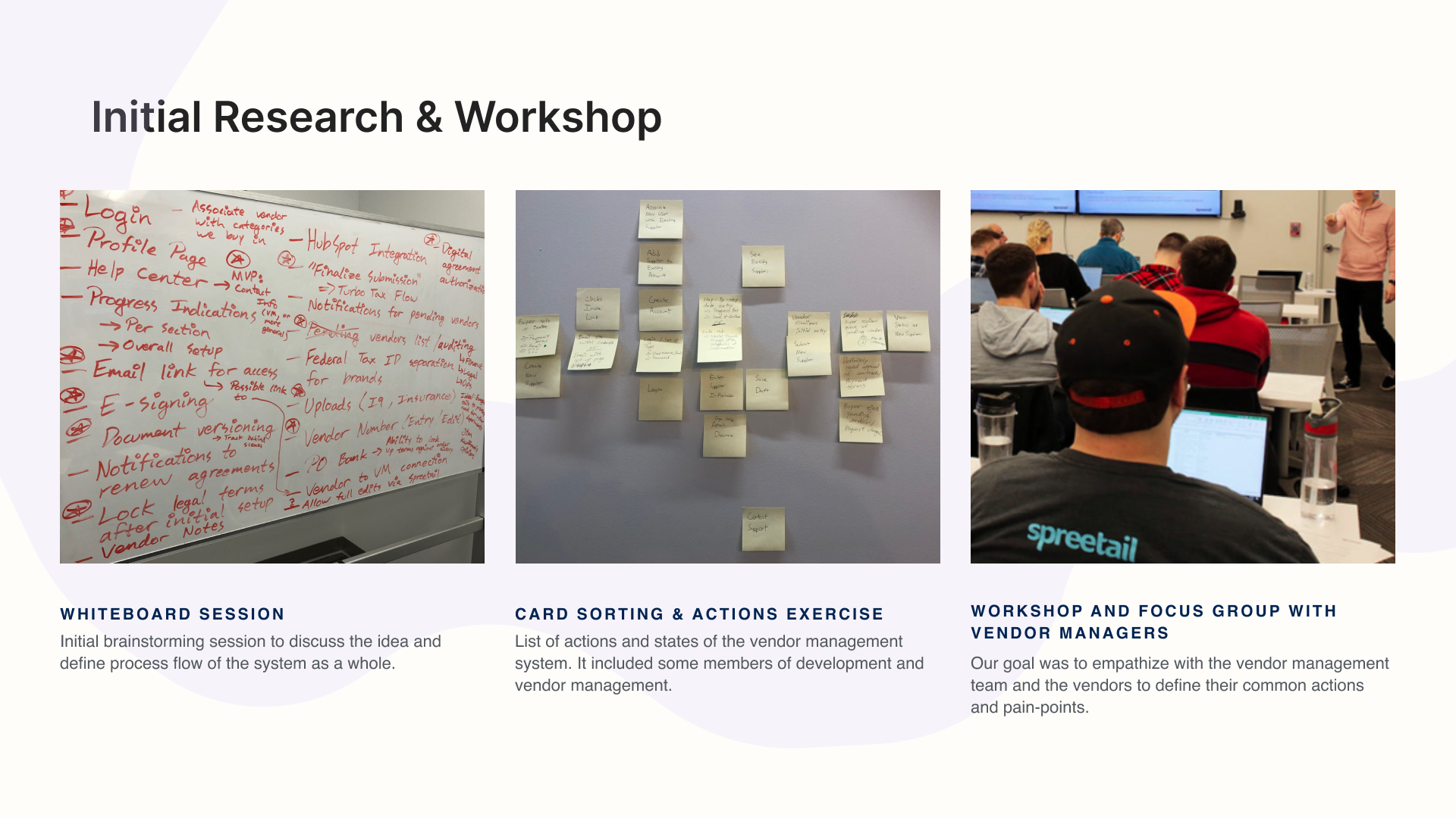
The UX design team received a proposal from a vendor manager suggesting a dashboard for vendors to manage accounts. The goal is to provide vendors with a tool to enhance efficiency, boost sales, strengthen relationships, and contribute to Spreetail's success.
This process included UX activities such as an initial brainstorming session, a cord sort, and a workshop including internal vendor managers and the development team.
This project was built to give a quick overview of the complete health of warehouse management. I held a UX workshop where we found that overall knowledge of warehouse needs was important to communicate quickly. Such as items that need to be shipped, gathered from inventory, where they exist in the warehouse, inventory quantity, and how well the team is accomplishing these tasks.
This was a redesign effort for how a warehouse teammate sees orders coming in while using GPS for where the user is in relationship to items. It would guide them on which items needed to be gathered for shipment.
Providing a view into the process of having multiple employees gather order items from the shelves and providing insight.
Provides the ability to deploy labels to be printed from a batch of orders and the details included in the batch.
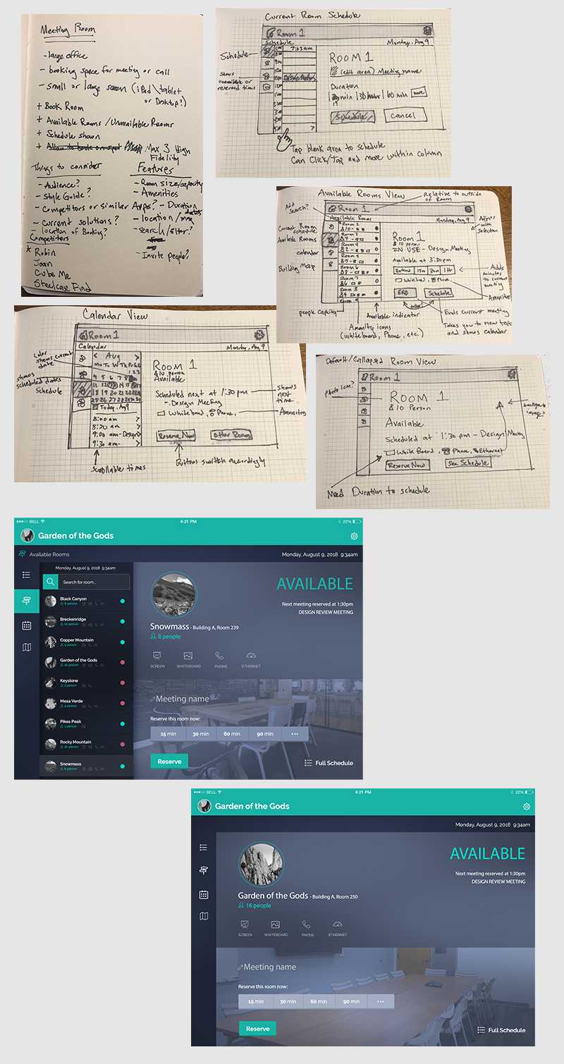
An idea to host an internal app that helped someone schedule or reserve a room on the fly. Concept drawings and paper prototyping included.
TextExpander is an app that provides the ability to recall reusable content by entering a unique abbreviation. I developed marketing items for sponsorship and events including the design of certain online presence.
Design of ads that existed in handouts of trade shows or ads in magazines.
2 examples of pull-up banners I designed for conferences and trade shows.
A series of three videos where I helped to write the video script and did art direction with the production process. This is one example of the three videos developed for targeted audiences of TextExpander.
Three separate landing pages that I designed and developed. Each of them are linked from specific pre-roll videos that are being hosted on youtube.
Hudl offers an app with tools to edit and share video for sports.
During the first few months at Hudl, I worked in Marketing and helped to generate knowledge of the product in the industry. I made the choice to start working as Product Designer that worked on designing parts of the app while guiding the development process.
One of the main projects I was tasked with was organizing video to make it accessible on mobile devices. This is typically step one in almost all actions you can take within the app so it was extremely important.
Hudl is very user-centric and as a Product Designer, I was tasked with guiding the team along with integrating designs with other Product Designers within Hudl. Creating a guideline that makes sense to the team as well as removing the element of assumptions is important. As a result, I ran internal sketch sessions to come up with relationships within the layout, to quickly and effectively solve designs.
Often times, I would sketch up drawings of relationships I was considering for the system and vet it within the audience to determine which one had the most comprehension. This meant sharing with coaches or athletes and testing with paper prototypes.
Solving for the video library meant keeping in mind different devices and design conventions on mobile. Information hierarchy, orientation, color, iconography, layout were all things that needed to be reconsidered on every device yet keeping the app congruent and the integrity of the company style guide.
Several projects I worked on were rapidly designed and developed. I designed this quick experience to include video from your Hudl account into a presentation. I designed a way to present videos, plays, stats, and reporting within a template to export and present information.
This interface I designed to show the user different angles captured at the same game. Allowing the ability to split and edit video while lining up plays and seconds captured throughout the game.
Aglix is a software development company that uses highly-designed concepts in presentations.
I worked as a User Interface Designer that helped develop the experience to the client with the use of design.
This app offers trajectory and ballistic calculations with specific ammo and element conditions.
I designed the user interface and guided the development team.
High fidelity designs, custom iconography and considerations for iOS.
I also worked on a concept for providing cattle auctions online. I started with a mobile first wireframe approach to layout the concept and navigation prior to moving to the desktop layout.
After proving initial sketches, I then designed the mostly high-fidelity version of the cattle auction for desktop.
This was a high-fidelity design that provides a gamification aspect for participating in social media.
University of Nebraska in Lincoln, Nebraska is the state's oldest and largest University of Nebraska’s system. I was the Senior Designer while leading a design team in the admissions division of the University. Our job was to attract prospective students through marketing campaigns in print and online.
Assisted in photoshoot of students and alumni of UNL to develop UNL promotional magazine where I designed layout and typography.
Finding majors and exploration of what UNL has to offer is a large part of what I was in charge of considering. Illustration, design of layout, user interface and user experience were all things I was in charge of designing.
My responsibilities were flexible between designing software interfaces and producing marketing materials to help these internal entities with business development.
Investing in online and application software companies such as the two below.
EliteForm is a system created with the idea of leveraging technology as a tool to enhance athlete training and performance.
I designed and developed the initial website design for the company.
I designed trade show presence for the team and carried the branding throughout all marketing materials.
I worked on the design and execution of the app that athletes use at the rack in the weight room.
This is he admin view for the app where coaches can adjust the workout programs and leave notes for the team. I was involved in creating design relationships, iconography and the experience.
Internal consulting software development firm where I helped produce marketing materials.
In the last decade or more, I have had the pleasure of working on design work. Here are just a few examples of freelance work or things that I am proud of creating.
Just like people that own trucks who get asked to help people move, I get asked to make design work. These are either for self-promotion for a bike race I host, or design work for a friend.
Logo Design for four different bicycle races for Gravel Worlds
Patch designs for Gravel Worlds Bicycle Race
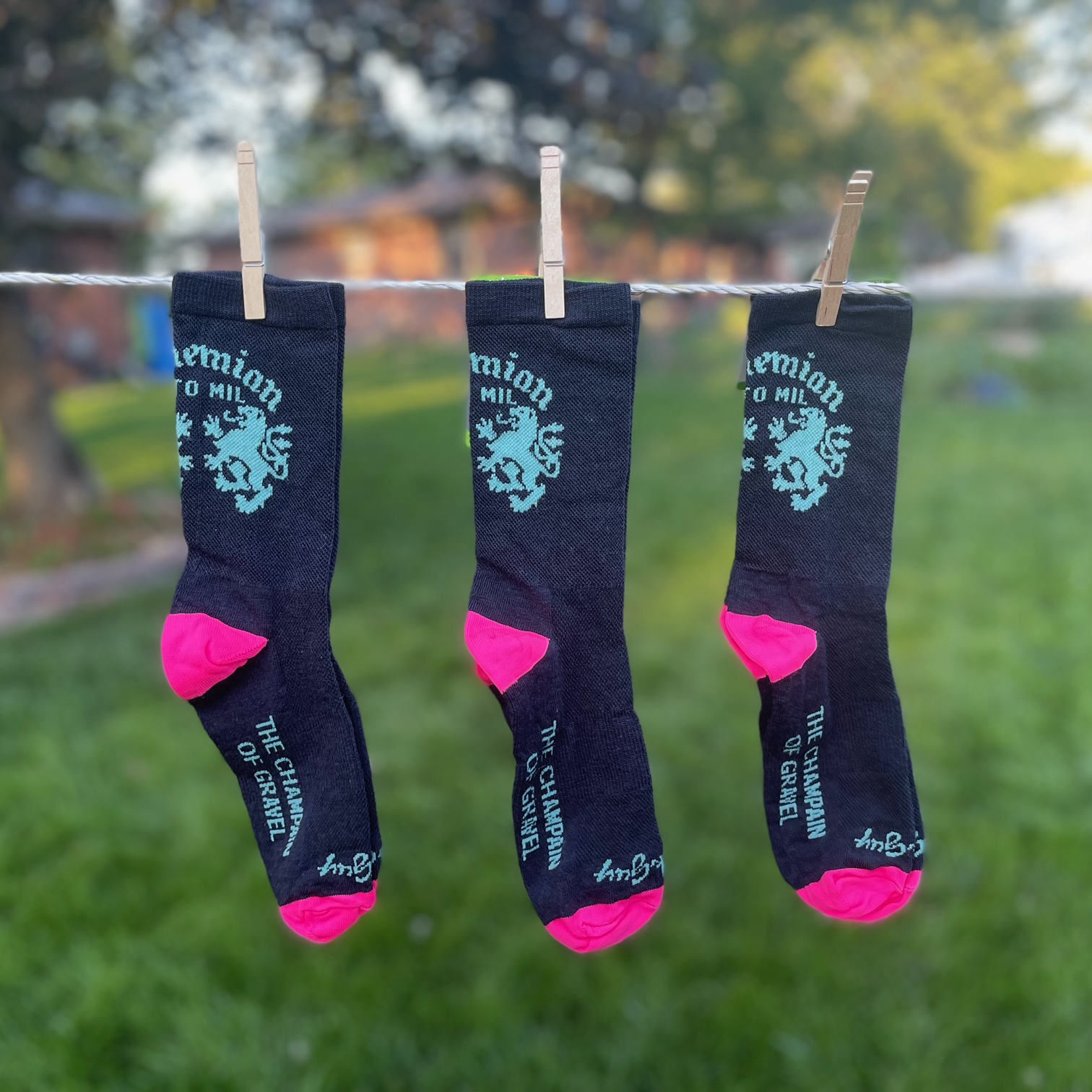
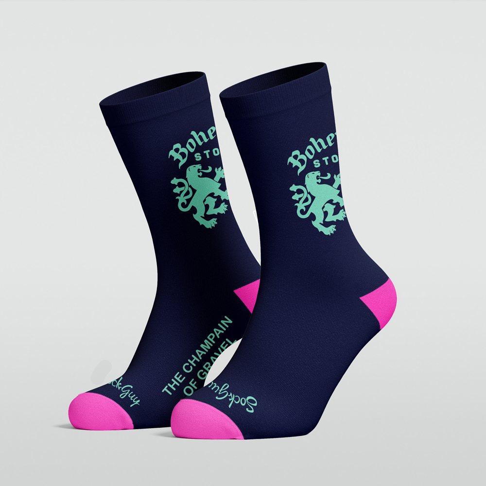
2019 Bohemian Sto Mil Gravel Race promotional design
I designed and developed a very simple initial website for the team.
A bandana design I made representing the Bohemian Sto Mil cycling race which I host every year with a couple of friends.
2018 Sto Mil t-shirt design and logo for tshirts and patches.
“Til death do us part” wedding invitation, concept, layout, typography design.
Poster art design, layout and typography. Concept was based around the cause, my friend had part of her tongue removed due to tongue cancer.
Cycling club design for posters and social media.
Local coffee shop brand I created and continue to do announcement posters in exchange of free coffee.